目录
Android CheckBox 复选框
获得选中的 CheckBox 的值
自定义点击效果
改变文字与选择框的相对位置
修改文字与选择框的距离
Android ToggleButton 开关按钮
改变 ToggleButton 的状态和文本
Android Switch 开关
改变 Switch 的状态和文本
Android CheckBox 复选框
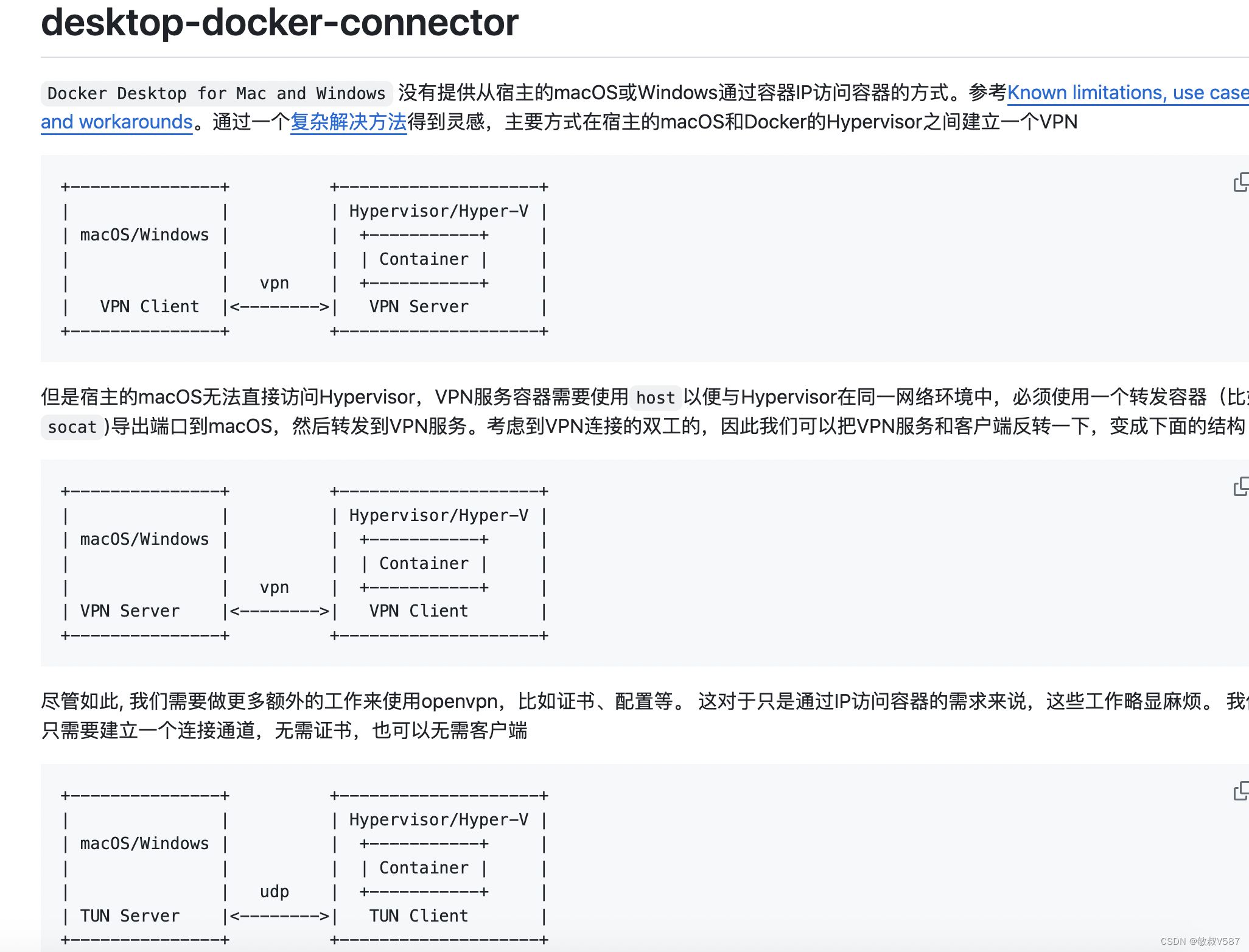
Android 中的 CheckBox 是一种复选框,继承自 Button。它的主要作用是允许用户在选中和未选中状态之间切换,通常用于让用户从多个选项中选择一个或多个。
以下是一些关于 CheckBox 的重要属性和方法:
属性:
- android:checked:设置或获取 CheckBox 的选中状态。
- android:text:设置 CheckBox 的显示文本。
方法:
- isChecked():检查 CheckBox 当前是否被选中。
- setChecked(boolean checked):设置 CheckBox 的选中状态。
获得选中的 CheckBox 的值
<?xml version="1.0" encoding="utf-8"?>
<LinearLayoutxmlns:android="http://schemas.android.com/apk/res/android"android:layout_width="match_parent"android:layout_height="match_parent"android:orientation="horizontal"android:gravity="center"><CheckBoxandroid:id="@+id/checkBox1"android:layout_width="wrap_content"android:layout_height="wrap_content"android:text="选项 1"/><CheckBoxandroid:id="@+id/checkBox2"android:layout_width="wrap_content"android:layout_height="wrap_content"android:text="选项 2"/><CheckBoxandroid:id="@+id/checkBox3"android:layout_width="wrap_content"android:layout_height="wrap_content"android:text="选项 3"/><Buttonandroid:id="@+id/showButton"android:layout_width="wrap_content"android:layout_height="wrap_content"android:text="显示所选复选框值"/></LinearLayout>
package com.example.myapplication;import android.os.Bundle;
import android.view.View;
import android.widget.CheckBox;
import android.widget.Toast;import androidx.appcompat.app.AppCompatActivity;import java.util.ArrayList;
import java.util.List;public class MainActivity extends AppCompatActivity {@Overrideprotected void onCreate(Bundle savedInstanceState) {super.onCreate(savedInstanceState);setContentView(R.layout.activity_main);final CheckBox checkBox1 = findViewById(R.id.checkBox1);final CheckBox checkBox2 = findViewById(R.id.checkBox2);final CheckBox checkBox3 = findViewById(R.id.checkBox3);findViewById(R.id.showButton).setOnClickListener(new View.OnClickListener() {@Overridepublic void onClick(View v) {StringBuilder selectedValues = new StringBuilder();if (checkBox1.isChecked()) {selectedValues.append(checkBox1.getText()).append("\n");}if (checkBox2.isChecked()) {selectedValues.append(checkBox2.getText()).append("\n");}if (checkBox3.isChecked()) {selectedValues.append(checkBox3.getText()).append("\n");}// 显示选中的值if (selectedValues.length() > 0) {Toast.makeText(MainActivity.this, "选中的值:" + selectedValues.toString(), Toast.LENGTH_SHORT).show();} else {Toast.makeText(MainActivity.this, "没有选中任何值", Toast.LENGTH_SHORT).show();}}});}
}
自定义点击效果
先将图片放到res/drawable 目录下


1、在 res/drawable 目录下新建 selctor 资源文件 language_checkbox.xml ,用于设置选中与没选中时的切换图片
<?xml version="1.0" encoding="utf-8"?>
<selector xmlns:android="http://schemas.android.com/apk/res/android"><itemandroid:state_enabled="true"android:state_checked="true"android:drawable="@drawable/checkbox_unchecked"/><itemandroid:state_enabled="true"android:state_checked="false"android:drawable="@drawable/checkbox_checked" />
</selector>
2、修改 activity_main.xml 添加几个 RadioButton ,通过属性 android:button="@drawable/language_checkbox"
<?xml version="1.0" encoding="utf-8"?>
<LinearLayoutxmlns:android="http://schemas.android.com/apk/res/android"android:layout_width="match_parent"android:layout_height="match_parent"android:orientation="horizontal"android:gravity="center"><CheckBoxandroid:id="@+id/android"android:text="C#"android:checked="true"android:button="@drawable/language_checkbox"android:layout_width="wrap_content"android:layout_height="wrap_content" /><CheckBoxandroid:id="@+id/ios"android:text="Python"android:checked="true"android:button="@drawable/language_checkbox"android:layout_width="wrap_content"android:layout_height="wrap_content" /><CheckBoxandroid:id="@+id/java"android:text="Java"android:checked="true"android:button="@drawable/language_checkbox"android:layout_width="wrap_content"android:layout_height="wrap_content" />
</LinearLayout>
改变文字与选择框的相对位置
可以使用 android:button="@null" 来移除原生的选择框,并使用 android:drawableTop、android:drawableLeft、android:drawableRight 或 android:drawableBottom 属性来设置文本和选择框的相对位置。
<?xml version="1.0" encoding="utf-8"?>
<LinearLayoutxmlns:android="http://schemas.android.com/apk/res/android"android:layout_width="match_parent"android:layout_height="match_parent"android:orientation="horizontal"android:gravity="center"><CheckBoxandroid:id="@+id/customCheckBox"android:layout_width="wrap_content"android:layout_height="wrap_content"android:text="自定义复选框"android:button="@null"android:drawableLeft="@android:drawable/btn_radio"android:drawablePadding="8dp"android:gravity="center_vertical"android:paddingLeft="10dp"/></LinearLayout>
在这个示例中,我使用了 android:drawableLeft="@android:drawable/btn_radio" 将选择框放置在文本的左边,并通过设置 android:drawablePadding 属性来调整选择框和文本之间的间距。我们还通过设置 android:gravity="center_vertical" 将文本垂直居中,并通过设置 android:paddingLeft 属性来调整选择框和左边边界的间距。
修改文字与选择框的距离
对于调整文字与选择框之间的距离,可以使用以下两种方法:
方法一:在 XML 中使用 android:paddingXXX 属性
可以直接在 XML 布局文件中使用 android:paddingXXX 属性来控制文字与选择框之间的距离。这种方法简单直接。
以下是关于使用 android:paddingXXX 属性的一些重要信息:
- 选择合适的属性:根据需要调整的方向(左、上、右、下),选择相应的 android:paddingLeft、android:paddingTop、android:paddingRight 或 android:paddingBottom 属性。
- 指定间距值:为了控制文本与选择框之间的间距,可以将所需的间距值直接设置为属性的值。您可以使用像素值(如 16dp)或其他尺寸单位(如 8sp)。
- 与其他布局属性的配合使用:android:paddingXXX 属性可以与其他布局属性一起使用,例如 android:layout_marginXXX。这样可以在不同的布局方向上添加外边距或内边距,从而更灵活地控制布局。
<?xml version="1.0" encoding="utf-8"?>
<LinearLayoutxmlns:android="http://schemas.android.com/apk/res/android"android:layout_width="match_parent"android:layout_height="match_parent"android:orientation="horizontal"android:gravity="center"><CheckBoxandroid:id="@+id/customCheckBox"android:layout_width="wrap_content"android:layout_height="wrap_content"android:text="自定义复选框"android:button="@null"android:drawableLeft="@android:drawable/btn_radio"android:drawablePadding="8dp"android:gravity="center_vertical"android:paddingLeft="10dp"/></LinearLayout>
在这个示例中,android:paddingLeft="10dp" 属性将文本与选择框的左边距设置为 10dp,这样就可以控制它们之间的间距。
方法二:使用 Java 代码动态计算 paddingLeft
// 设置 RadioButton 的选择框图像为指定的选择器(selector)
rb.setButtonDrawable(R.drawable.rad_btn_selctor);// 计算 RadioButton 左边距的值,这里将选择框图像的宽度(加上一些额外的间距)作为左边距
int rb_paddingLeft = getResources().getDrawable(R.mipmap.ic_checkbox_checked).getIntrinsicWidth() + 5; // 将计算得到的左边距应用到 RadioButton 上,这里只设置了左边距,其余边距保持不变
rb.setPadding(rb_paddingLeft, 0, 0, 0);
解释:
- setButtonDrawable(R.drawable.rad_btn_selctor):这一行设置了 RadioButton 的选择框图像为指定的选择器(selector),在选择器中定义了选中和未选中状态下的图像。
- getResources().getDrawable(R.mipmap.ic_checkbox_checked).getIntrinsicWidth() + 5:这一行计算了 RadioButton 左边距的值。首先,它从资源中获取了选择框图像的引用,并使用 getIntrinsicWidth() 方法获取选择框图像的实际宽度。然后,它添加了一些额外的间距(这里是 5 像素),以便在图像的右侧添加一些空白区域。
- setPadding(rb_paddingLeft, 0, 0, 0):最后,这一行将计算得到的左边距应用到 RadioButton 上。setPadding() 方法接收四个参数,分别是左、上、右、下边距的值。在这里,只设置了左边距,而其他边距保持不变。
Android ToggleButton 开关按钮
Android 中的 ToggleButton 是一种可以在两个状态之间切换的按钮,通常用于表示启用或禁用某些功能、选项或设置。它在外观上类似于一个带有开关标志的按钮,用户可以点击它来切换状态。
ToggleButton 继承自 CompoundButton,因此它具有 CompoundButton 的所有功能,比如可以通过代码设置选中状态、监听状态变化等。除了默认的开关状态外,ToggleButton 还可以自定义开关状态的图标和颜色。
ToggleButton 提供了这些属性:
- android:textOn:当 ToggleButton 处于打开状态时显示的文本。
- android:textOff:当 ToggleButton 处于关闭状态时显示的文本。
- android:disabledAlpha 当 ToggleButton 处于 禁用 时的透明度。
<?xml version="1.0" encoding="utf-8"?>
<LinearLayoutxmlns:android="http://schemas.android.com/apk/res/android"android:layout_width="match_parent"android:layout_height="match_parent"android:orientation="horizontal"android:gravity="center"><ToggleButtonandroid:id="@+id/toggleButton"android:layout_width="wrap_content"android:layout_height="wrap_content"android:disabledAlpha="1"android:enabled="false"android:textOn="开启"android:textOff="关闭" />
</LinearLayout>
也可以在 Java 代码中动态设置这些文本,例如:
ToggleButton toggleButton = findViewById(R.id.toggleButton);
toggleButton.setTextOn("启用");
toggleButton.setTextOff("禁用");
改变 ToggleButton 的状态和文本
ToggleButton 提供了一些方法和事件,用于改变或获取自身的状态和开关时的文本。下面是这些方法和事件的说明:
方法:
- getTextOff():获取 ToggleButton 关时显示的文本。
- getTextOn():获取 ToggleButton 开时显示的文本。
- setChecked(boolean checked):设置 ToggleButton 是否选中。
- setTextOff(CharSequence textOff):设置 ToggleButton 关时显示的文本。
- setTextOn(CharSequence textOn):设置 ToggleButton 开时显示的文本。
- toggle():切换 ToggleButton 的开关状态。
事件:
- CompoundButton.OnCheckedChangeListener:当 ToggleButton 的开关状态改变时触发。
可以使用这些方法和事件来动态改变 ToggleButton 的状态和显示文本。例如,可以通过 setChecked() 方法设置 ToggleButton 的选中状态,通过 setTextOn() 和 setTextOff() 方法设置开关时显示的文本,通过 toggle() 方法切换 ToggleButton 的状态。同时,也可以通过设置 CompoundButton.OnCheckedChangeListener 来监听 ToggleButton 的状态改变事件,并在事件触发时执行相应的操作。
示例
<?xml version="1.0" encoding="utf-8"?>
<LinearLayoutxmlns:android="http://schemas.android.com/apk/res/android"android:layout_width="match_parent"android:layout_height="match_parent"android:orientation="horizontal"android:gravity="center"><ToggleButtonandroid:id="@+id/toggleButton"android:layout_width="wrap_content"android:layout_height="wrap_content"android:textOn="开启"android:textOff="关闭"android:checked="true" /><Buttonandroid:id="@+id/button"android:layout_width="wrap_content"android:layout_height="wrap_content"android:text="改变状态和文本" />
</LinearLayout>
package com.example.myapplication;
import androidx.appcompat.app.AppCompatActivity;import android.os.Bundle;
import android.view.View;
import android.widget.Button;
import android.widget.CompoundButton;
import android.widget.ToggleButton;public class MainActivity extends AppCompatActivity {private ToggleButton toggleButton;private Button button;@Overrideprotected void onCreate(Bundle savedInstanceState) {super.onCreate(savedInstanceState);setContentView(R.layout.activity_main);toggleButton = findViewById(R.id.toggleButton);button = findViewById(R.id.button);button.setOnClickListener(new View.OnClickListener() {@Overridepublic void onClick(View v) {// 切换 ToggleButton 的状态toggleButton.toggle();// 获取 ToggleButton 的当前状态boolean isChecked = toggleButton.isChecked();// 根据当前状态设置不同的文本if (isChecked) {toggleButton.setTextOn("已开启");toggleButton.setTextOff("关闭");} else {toggleButton.setTextOn("开启");toggleButton.setTextOff("已关闭");}}});}
}
Android Switch 开关
Android 中的 Switch 组件允许用户在两种状态之间切换,通常表示打开或关闭某种功能或选项。与 ToggleButton 类似,Switch 也具有两种状态,但与 ToggleButton 不同的是,Switch 在 UI 上会同时显示开和关状态的文本,并且开关状态更加直观。
Switch (开关) 继承自 Button 和 CompoundButton,所以拥有它们的属性、方法和事件。
Switch 组件提供了一系列属性,让您可以根据需要自定义开关的外观和行为。以下是一些常用的属性:
- android:showText:设置在开启和关闭状态时是否显示文字。
- android:splitTrack:确定开关滑块与底部轨道之间是否显示间隔。
- android:switchMinWidth:设置开关的最小宽度。
- android:switchPadding:设置滑块内文字与滑块边缘之间的间距。
- android:switchTextAppearance:设置开关的文字外观。
- android:textOff:设置在按钮未选中时显示的文字。
- android:textOn:设置在按钮选中时显示的文字。
- android:textStyle:设置文字的样式,例如普通、粗体、斜体或粗斜体。
- android:track:设置底部轨道的图片。
- android:thumb:设置开关滑块的图片。
- android:typeface:设置文字的字体类型,默认支持三种:sans、serif 和 monospace。
例子
<?xml version="1.0" encoding="utf-8"?>
<LinearLayoutxmlns:android="http://schemas.android.com/apk/res/android"android:layout_width="match_parent"android:layout_height="match_parent"android:orientation="horizontal"android:gravity="center"><Switchandroid:id="@+id/switchButton"android:layout_width="wrap_content"android:layout_height="wrap_content"android:textOn="开"android:textOff="关"android:checked="true"android:showText="true"android:layout_margin="16dp"android:switchPadding="8dp"android:switchMinWidth="120dp"android:textStyle="bold"android:textSize="16sp"android:layout_gravity="center"/></LinearLayout>
改变 Switch 的状态和文本
Switch 提供了一些方法用来改变或获取自身的状态和开关时的文本
- getTextOff():获取 Switch 关闭时显示的文本。
- getTextOn():获取 Switch 打开时显示的文本。
- setChecked(boolean checked):设置 Switch 是否选中。
- setTextOff(CharSequence textOff):设置 Switch 关闭时显示的文本。
- setTextOn(CharSequence textOn):设置 Switch 打开时显示的文本。
- toggle():改变 Switch 的开关状态。
- CompoundButton.OnCheckedChangeListener:当 Switch 的开关状态改变时触发的事件。
例子:
<?xml version="1.0" encoding="utf-8"?>
<LinearLayoutxmlns:android="http://schemas.android.com/apk/res/android"android:layout_width="match_parent"android:layout_height="match_parent"android:orientation="horizontal"android:gravity="center"><Switchandroid:id="@+id/switchButton"android:layout_width="wrap_content"android:layout_height="wrap_content" /><Buttonandroid:id="@+id/changeButton"android:layout_width="wrap_content"android:layout_height="wrap_content"android:text="切换开关" /></LinearLayout>
package com.example.myapplication;
import androidx.appcompat.app.AppCompatActivity;import android.os.Bundle;
import android.view.View;
import android.widget.Button;
import android.widget.CompoundButton;
import android.widget.Switch;
import android.widget.Toast;
import android.widget.ToggleButton;public class MainActivity extends AppCompatActivity {@Overrideprotected void onCreate(Bundle savedInstanceState) {super.onCreate(savedInstanceState);setContentView(R.layout.activity_main);Switch switchButton = findViewById(R.id.switchButton);// 设置 Switch 关闭时的文本switchButton.setTextOff("Off");// 设置 Switch 打开时的文本switchButton.setTextOn("On");// 设置 Switch 的初始状态为打开switchButton.setChecked(true);// 设置 Switch 的状态改变监听器switchButton.setOnCheckedChangeListener(new CompoundButton.OnCheckedChangeListener() {@Overridepublic void onCheckedChanged(CompoundButton buttonView, boolean isChecked) {if (isChecked) {// Switch 打开时的操作Toast.makeText(MainActivity.this, "开关打开", Toast.LENGTH_SHORT).show();} else {// Switch 关闭时的操作Toast.makeText(MainActivity.this, "开关关闭", Toast.LENGTH_SHORT).show();}}});// 点击按钮来改变 Switch 的状态findViewById(R.id.changeButton).setOnClickListener(v -> switchButton.toggle());}
}