1.弹性布局---flex布局
弹性布局是一种常见且好用的布局方式,它可以让结构中的内容自适应不同的分辨率,简化的代码的书写。
使用方法
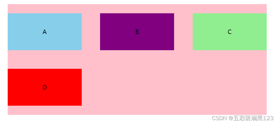
给父盒子加上display:flex;默认子元素不换行,如果装不开,子元素会缩小元素的宽度。
父级元素常用属性
-
flex-direction 设置主轴方向,默认水平为主轴。row:水平为主轴,column:竖直方向为主轴
-
justify-content 设置主轴方向上子元素的排列方式 。 flex-start:默认从头开始,如果主轴是x轴,则从左往右;flex-end:从尾部开始;center:在主轴居中对齐;space-around:平分剩余空间;space-between:先两边贴边,再平分剩余空间
-
flex-wrap 设置是否换行。 wrap,换行,如果放不下,则会换行;nowrap:不换行,当父级装不下,则会压缩子元素。
-
align-items 设置侧周上的子元素排列方式 --单行
-
align-content 设置侧周上的子元素排列方式 --多行
-
flex-flow 复合属性,相当于同时设置了flex-direction 和 flex-wrap
代码演示(部分属性)
<!DOCTYPE html>
<html lang="en"><head><meta charset="UTF-8" /><meta http-equiv="X-UA-Compatible" content="IE=edge" /><meta name="viewport" content="width=device-width, initial-scale=1.0" /><title>Document</title></head><style>* {margin: 0;padding: 0;box-sizing: border-box;}li {list-style: none;}.box {width: 700px;height: 300px;margin: 100px auto;background-color: pink;}ul {display: flex;flex-direction: row; /*设置主轴方向*/justify-content: space-between; /*设置主轴上元素排列方式*/flex-wrap: wrap; /*设置是否换行*/align-items: center; /* 设置侧周方向上子元素排列方式 -- 单行*//* align-content: space-between; */ /* 设置侧周方向上子元素排列方式 --多行*//* flex-flow: row wrap; */ /* 同时设置主轴方向和是否换行 */}li {width: 200px;height: 100px;text-align: center;line-height: 100px;background-color: skyblue;}ul {height: 100%;}li:nth-child(2) {background-color: purple;}li:nth-child(3) {background-color: lightgreen;}li:last-child {background-color: red;}</style><body><div class="box"><ul><li>A</li><li>B</li><li>C</li><li>D</li></ul></div></body>
</html>
子项目常用属性
- flex 定义子项分配剩余的空间,用flex表示占据多数分数
- align-self align-self属性允许单个项目有与其他项目不一样的对齐方式,且可覆盖 align-items属性。默认值为auto,表示子项继承父项的align-items属性。
- order 用来定义子项目的排列顺序,数值越小,排列越靠前,默认值为0。
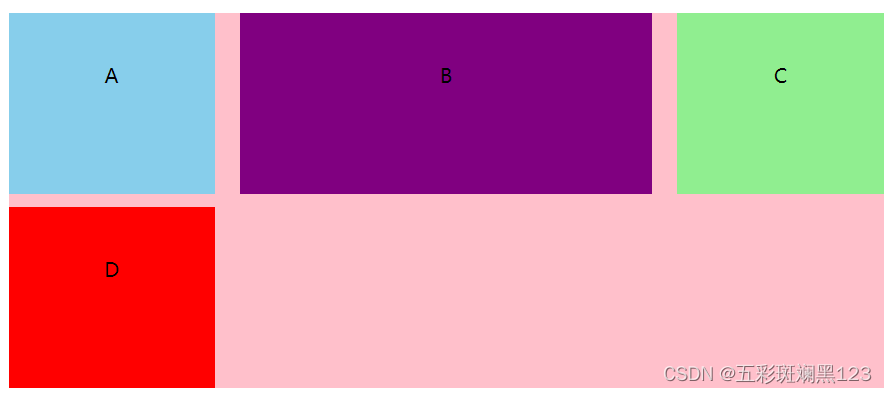
2.grid布局。
grid是二维布局方式,可以同时控制行和列的排布和对齐方式。
使用方法
要开启grid布局,只需要给父级盒子加上display:grid。
常用属性
- grid-template-columns:定义每一列的宽度
-
grid-template-rows:设置每一行的宽度
grid-template-rows和grid-template-columns的参数可以是一个固定值也可以是fr(浮动宽度,是grid布局专有单位,代表grid剩余空间)
-
row-gap:设置行间距
-
column-gap:设置列间距
-
gap:统一设置行间距和列间距
css代码演示
ul {display: grid;/* grid-template-columns: 100px 100px 100px; */ /* 将子元素设置为三列,每列宽度为100px */grid-template-columns: 1fr 2fr 1fr;grid-template-rows: 1fr 1fr;/* column-gap: 20px; 设置列间距 *//* row-gap: 10px; 设置行间距 */gap: 10px 20px; /* 统一设置行间距和列间距 */}效果
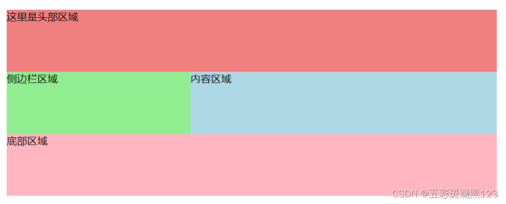
- grid-template-areas:排列元素;grid-area:指定元素对应的区域
代码演示
<!DOCTYPE html>
<html lang="en"><head><meta charset="UTF-8" /><meta http-equiv="X-UA-Compatible" content="IE=edge" /><meta name="viewport" content="width=device-width, initial-scale=1.0" /><title>Document</title></head><style>* {margin: 0;padding: 0;box-sizing: border-box;}.box {display: grid;/* 设置元素排列方式 */grid-template-areas: 'header header header' 'sidebar content content' 'footer footer footer';width: 50%;height: 40vh;margin: 100px auto;}header {/* 指定当前元素对应的区域 */grid-area: header;background-color: lightcoral;}aside {grid-area: sidebar;background-color: lightgreen;}main {grid-area: content;background-color: lightblue;}footer {grid-area: footer;background-color: lightpink;}</style><body><div class="box"><header>这里是头部区域</header><aside>侧边栏区域</aside><main>内容区域</main><footer>底部区域</footer></div></body>
</html>
效果
grid布局对齐方式
-
justify-items:设置水平方向上对齐方式
-
align-items:设置垂直方向上对齐方式
-
当行和列的尺寸小于父级尺寸,可以通过align-content和justify-content对轨道的对齐方式进行操作
本文介绍并不完全,若要精通,还需自己多练习。
逆风的方向,更适合飞翔!