CSS学习|第三章
- 前言
- 十五、精灵图
- 十六、字体图标
- 十七、CSS 三角的做法
- 十八、用户界面样式
- 十九、vertical-align 属性应用
- 二十、溢出文字省略号显示
- 二十一、常见布局技巧
前言
小白开始干前端
生命不息,学习不止~~
以下内容源于黑马前端教程,纯属搬运工了
上篇:CSS 学习 | 第二章
十五、精灵图

一个网页中往往会应用很多小的背景图像作为修饰,当网页中的图像过多时,服务器就会频繁地接收和发送请求图片,造成服务器请求压力过大,这将大大降低页面的加载速度。因此,为了有效地减少服务器接收和发送请求的次数,提高页面的加载速度,出现了 CSS 精灵技术(也称CSS Sprites、CSS 雪碧)。
核心原理:将网页中的一些小背景图像整合到一张大图中 ,这样服务器只需要一次请求就可以了。
精灵图的使用:
- 精灵技术主要针对于背景图片使用。就是把多个小背景图片整合到一张大图片中
- 这个大图片也称为 sprites 精灵图 或者 雪碧图
- 移动背景图片位置, 此时可以使用 background-position
- 移动的距离就是这个目标图片的 x 和 y 坐标。注意网页中的坐标有所不同
- 因为一般情况下都是往上往左移动,所以数值是负值。
- 使用精灵图的时候需要精确测量,每个小背景图片的大小和位置
例如:
<!DOCTYPE html>
<html lang="en"><head><meta charset="UTF-8"><meta name="viewport" content="width=, initial-scale=1.0"><title>精灵图</title><style>.box1 {width: 60px;height: 60px;margin: 100px auto;background: url(images/sprites.png) -182px 0;}.box2 {width: 27px;height: 25px;margin: 200px;background: url(images/sprites.png) -155px -106px;}</style>
</head><body><div class="box1"></div><div class="box2"></div>
</body></html>
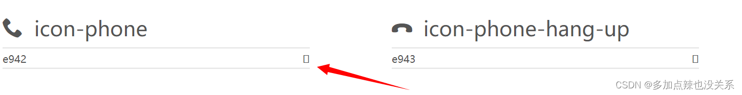
十六、字体图标
字体图标使用场景: 主要用于显示网页中通用、常用的一些小图标。
精灵图是有诸多优点的,但是缺点很明显。
- 图片文件还是比较大的。
- 图片本身放大和缩小会失真。
- 一旦图片制作完毕想要更换非常复杂。
此时,有一种技术的出现很好的解决了以上问题,就是字体图标 iconfont。
字体图标可以为前端工程师提供一种方便高效的图标使用方式,展示的是图标,本质属于字体。
字体图标的优点:
- 轻量级:一个图标字体要比一系列的图像要小。一旦字体加载了,图标就会马上渲染出来,减少了服务器请求
- 灵活性:本质其实是文字,可以很随意的改变颜色、产生阴影、透明效果、旋转等
- 兼容性:几乎支持所有的浏览器,请放心使用
注意: 字体图标不能替代精灵技术,只是对工作中图标部分技术的提升和优化。
总结:
- 如果遇到一些结构和样式比较简单的小图标,就用字体图标。
- 如果遇到一些结构和样式复杂一点的小图片,就用精灵图。
字体图标的下载:
字体图标是一些网页常见的小图标,我们直接网上下载即可。
- icomoon 字库 http://icomoon.io
- 阿里 iconfont 字库 http://www.iconfont.cn/
字体图标的引入:
- 把下载包里面的
fonts文件夹放到页面的根目录下 - 在 CSS 样式中全局声明字体: 简单理解把这些字体文件通过 css 引入到我们页面中
@font-face {font-family: 'icomoon';src: url('fonts/icomoon.eot?7kkyc2');src: url('fonts/icomoon.eot?7kkyc2#iefix') format('embedded-opentype'),url('fonts/icomoon.ttf?7kkyc2') format('truetype'),url('fonts/icomoon.woff?7kkyc2') format('woff'),url('fonts/icomoon.svg?7kkyc2#icomoon') format('svg');font-weight: normal;font-style: normal;
}
.html标签内添加小图标
<span></span>
示例:
<!DOCTYPE html>
<html lang="en"><head><meta charset="UTF-8"><meta name="viewport" content="width=device-width, initial-scale=1.0"><title>字体图标的使用</title><style>@font-face {font-family: 'icomoon';src: url('fonts/icomoon.eot?7kkyc2');src: url('fonts/icomoon.eot?7kkyc2#iefix') format('embedded-opentype'),url('fonts/icomoon.ttf?7kkyc2') format('truetype'),url('fonts/icomoon.woff?7kkyc2') format('woff'),url('fonts/icomoon.svg?7kkyc2#icomoon') format('svg');font-weight: normal;font-style: normal;}span {font-family: 'icomoon';font-size: 50px;}</style>
</head><body><span></span><span></span>
</body></html>
十七、CSS 三角的做法
网页中常见一些三角形,使用 CSS 直接画出来就可以,不必做成图片或者字体图标。
<!DOCTYPE html>
<html lang="en"><head><meta charset="UTF-8"><meta name="viewport" content="width=device-width, initial-scale=1.0"><title>css 三角的做法</title><style>.box {/* 宽高设置为 0 */width: 0;height: 0;margin: 20px auto;/* 倘若需要一个需要一个向下的三角:只需要将顶部边框设置颜色,其余边框设置为透明就行了 */border: 10px solid transparent;border-top: 10px solid red;}</style>
</head><body><!-- 向下的三角 --><div class="box"></div>
</body></html>
十八、用户界面样式
所谓的界面样式,就是更改一些用户操作样式,以便提高更好的用户体验
- 更改用户的鼠标样式
- 表单轮廓
- 防止表单域拖拽
1. 鼠标样式
语法:
li {cursor: pointer; }
设置或检索在对象上移动的鼠标指针采用何种系统预定义的光标形状
| 属性值 | 描述 |
|---|---|
| default | 默认样式 |
| pointer | 小手样式 |
| move | 移动样式 |
| text | 文本样式 |
| not-allowed | 禁止样式 |
例如:
<!DOCTYPE html>
<html lang="en"><head><meta charset="UTF-8"><meta name="viewport" content="width=device-width, initial-scale=1.0"><title>用户界面样式-鼠标样式</title>
</head><body><ul><li style="cursor: default;">默认样式</li><li style="cursor: pointer;">小手样式</li><li style="cursor: move;">移动样式</li><li style="cursor: text;">文本样式</li><li style="cursor: not-allowed;">禁止样式</li></ul>
</body></html>
2. 表单轮廓
给表单添加 outline: 0; 或者 outline: none; 样式之后,就可以去掉默认的蓝色边框。
语法:
input {outline: none; }
示例:
<!DOCTYPE html>
<html lang="en"><head><meta charset="UTF-8"><meta name="viewport" content="width=device-width, initial-scale=1.0"><title>用户界面样式-表单轮廓</title><style>input {/* 取消表单轮廓 */outline: none;}</style>
</head><body><input type="text">
</body></html>
3. 防止拖拽文本域
实际开发中,我们文本域右下角是不可以拖拽的
语法:
textarea{ resize: none;}
示例:
<!DOCTYPE html>
<html lang="en"><head><meta charset="UTF-8"><meta name="viewport" content="width=device-width, initial-scale=1.0"><title>用户界面样式-防止拖拽文本域</title><style>textarea {/* 取消拖拽 */resize: none;/* 取消表单轮廓 */outline: none;}</style>
</head><body><!-- 防止拖拽文本域 --><textarea name="" id="" cols="30" rows="10"></textarea>
</body></html>
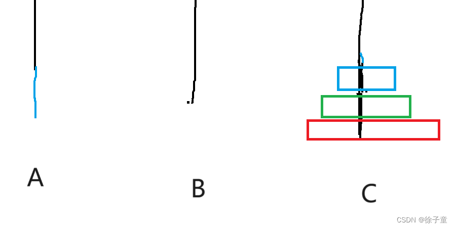
十九、vertical-align 属性应用
CSS 的 vertical-align 属性使用场景: 经常用于设置图片或者表单(行内块元素)和文字垂直对齐。
官方解释: 用于设置一个元素的垂直对齐方式,但是它只针对于行内元素或者行内块元素有效。
语法:
vertical-align : baseline | top | middle | bottom
| 属性 | 描述 |
|---|---|
| baseline | 默认,元素放在父元素的基线上 |
| top | 把元素的顶端与行中最高元素的顶端对齐 |
| middle | 把此元素放置在父元素的中部 |
| bottom | 把元素的顶端与行中最低的元素的顶端对齐 |
示例:
<!DOCTYPE html>
<html lang="en"><head><meta charset="UTF-8"><meta name="viewport" content="width=device-width, initial-scale=1.0"><title>vertical-align 属性应用</title>
</head><body><!-- 将头像与名称居中对齐 --><div class="user"><img src="images/user.png" alt="" style="vertical-align: middle;">qq-mike</div>
</body></html>
二十、溢出文字省略号显示
1. 单行文本溢出显示省略号
语法:
/*1. 先强制一行内显示文本*/white-space: nowrap; ( 默认 normal 自动换行)/*2. 超出的部分隐藏*/overflow: hidden;/*3. 文字用省略号替代超出的部分*/text-overflow: ellipsis;
示例:
<!DOCTYPE html>
<html lang="en"><head><meta charset="UTF-8"><meta name="viewport" content="width=device-width, initial-scale=1.0"><title>单行文本溢出显示省略号</title><style>div {width: 150px;height: 80px;background-color: pink;/* 强制文字显示在一行 */white-space: nowrap;/* 溢出部分隐藏起来 */overflow: hidden;/* 文字溢出时用省略号显示 */text-overflow: ellipsis;}</style>
</head><body><div>这里是内容这里是内容这里是内容这里是内容</div>
</body></html>
2. 多行文本溢出显示省略号
多行文本溢出显示省略号,有较大兼容性问题, 适合于 webKit 浏览器或移动端(移动端大部分是 webkit 内核)
语法:
overflow: hidden;
text-overflow: ellipsis;
/* 弹性伸缩盒子模型显示 */
display: -webkit-box;
/* 限制在一个块元素显示的文本的行数 */
-webkit-line-clamp: 2;
/* 设置或检索伸缩盒对象的子元素的排列方式 */
-webkit-box-orient: vertical;
更推荐让后台人员来做这个效果,因为后台人员可以设置显示多少个字,操作更简单
二十一、常见布局技巧
1. margin负值运用
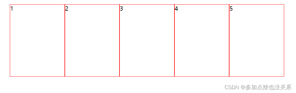
- 让每个盒子margin 往左侧移动 -1px 正好压住相邻盒子边框
- 鼠标经过某个盒子的时候,提高当前盒子的层级即可(如果没有有定位,则加相对定位(保留位置),如
果有定位,则加z-index)
示例:
<!DOCTYPE html>
<html lang="en"><head><meta charset="UTF-8"><meta name="viewport" content="width=device-width, initial-scale=1.0"><title>margin负值运用</title><style>ul li {position: relative;float: left;list-style: none;width: 150px;height: 200px;border: 1px solid red;margin-left: -1px;}ul li:hover {/* 如果盒子没有定位,则鼠标经过时设置相对定位 *//* position: relative; *//* 如果盒子有定位,则添加其层级 */z-index: 1;border: 1px solid blue;}</style>
</head><body><ul><li>1</li><li>2</li><li>3</li><li>4</li><li>5</li></ul>
</body></html>
2. 文字围绕浮动元素
添加浮动即可使文字围绕浮动元素
示例:
<!DOCTYPE html>
<html lang="en"><head><meta charset="UTF-8"><meta name="viewport" content="width=device-width, initial-scale=1.0"><title>文字围绕浮动元素</title><style>* {margin: 0;padding: 0;}.box {width: 300px;height: 70px;background-color: pink;}.pic {float: left;width: 120px;height: 60px;margin-right: 5px;}.pic img {width: 100%;}</style>
</head><body><div class="box"><div class="pic"><img src="images/img.png" alt=""></div><p>这里是内容这里是内容这里是内容这里是内容这里是内容</p></div>
</body></html>
3. 行内块巧妙运用
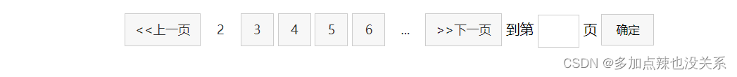
页码在页面中间显示:
- 把这些链接盒子转换为行内块, 之后给父级指定 text-align:center;
- 利用行内块元素中间有缝隙,并且给父级添加 text-align:center; 行内块元素会水平会居中
示例:
<!DOCTYPE html>
<html lang="en"><head><meta charset="UTF-8"><meta name="viewport" content="width=device-width, initial-scale=1.0"><title>行内块巧妙运用</title><style>* {margin: 0;padding: 0;}.box {text-align: center;}.box a {display: inline-block;width: 36px;height: 36px;background-color: #f7f7f7;border: 1px solid #ccc;/* 水平居中 */text-align: center;/* 垂直居中 */line-height: 36px;/* 取消下划线 */text-decoration: none;color: #333;font-size: 14px;}.box .prev,.box .next {width: 85px;}.box .current,.box .elp {background-color: #fff;border: none;}.box input {height: 36px;width: 45px;border: 1px solid #ccc;outline: none;}.box button {width: 60px;height: 36px;background-color: #f7f7f7;border: 1px solid #ccc;}</style>
</head><body><div class="box"><a href="#" class="prev"><<上一页</a><a href="#" class="current">2</a><a href="#">3</a><a href="#">4</a><a href="#">5</a><a href="#">6</a><a href="#" class="elp">...</a><a href="#" class="next">>>下一页</a>到第<input type="text">页<button>确定</button></div>
</body></html>
4. CSS 三角强化


示例:
<!DOCTYPE html>
<html lang="en"><head><meta charset="UTF-8"><meta name="viewport" content="width=device-width, initial-scale=1.0"><title>三角强化</title><style>.box {margin: 100px auto;width: 0;height: 0;/* 只保留左边的边框有颜色 */border-color: transparent red transparent transparent;/* 样式都是 solid */border-style: solid;/* 上边框宽度要大,右边框宽度稍小,其余的边框为 0 */border-width: 100px 50px 0 0;}.price {width: 160px;height: 24px;border: 1px solid red;margin: 0 auto;line-height: 24px;}.miaosha {position: relative;float: left;width: 90px;height: 100%;background-color: red;text-align: center;color: #fff;font-weight: 700;margin-right: 8px;}.miaosha i {position: absolute;right: 0;top: 0;width: 0;height: 0;border-color: transparent #fff transparent transparent;border-style: solid;border-width: 24px 10px 0 0;}.origin {font-size: 12px;color: gray;/* 添加删除线 */text-decoration: line-through;}</style>
</head><body><div class="box"></div><div class="price"><span class="miaosha">¥1560<i></i></span><span class="origin">¥3240</span></div>
</body></html>
参考文章:
灰色
橘色
红色
蓟色
代码